
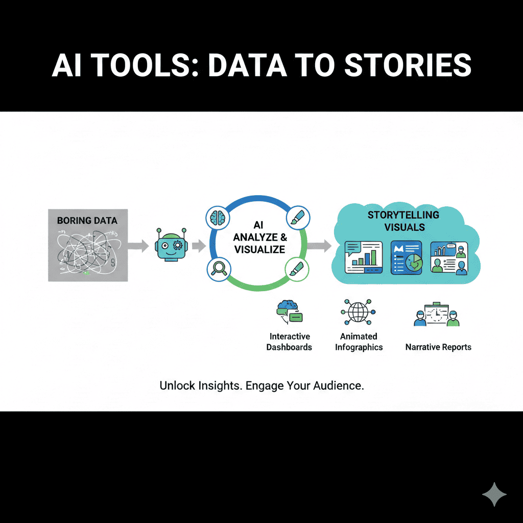
In today’s data-driven world, raw numbers and spreadsheets alone no longer capture attention or drive decisions. The real power lies in transforming those bland datasets into compelling narratives that resonate with audiences. This is where storytelling visuals emerge as the game-changer that bridges the gap between complex information and human understanding.
The evolution of artificial intelligence has revolutionized how we approach data visualization. Modern AI tools don’t just create charts and graphs—they craft visual narratives that engage, inform, and inspire action. Whether you’re a marketer presenting campaign results, a business analyst sharing quarterly reports, or an educator explaining complex concepts, storytelling visuals powered by AI can transform your communication effectiveness dramatically.
1. Understanding the Power of Storytelling Visuals in Modern Communication
Data storytelling represents a fundamental shift in how we communicate information. Traditional data presentation often falls flat because it fails to connect emotionally with audiences. Numbers, while accurate, lack the persuasive power of a well-crafted narrative combined with strategic visual elements.
Storytelling visuals leverage the human brain’s natural affinity for visual processing and narrative structure. Research shows that people remember stories up to 22 times more than facts alone. When you combine this with the fact that the human brain processes visuals 60,000 times faster than text, the synergy becomes undeniable.
The Psychology Behind Visual Storytelling
Our brains are hardwired to respond to visual information. When data is presented through compelling visuals, it activates multiple areas of the brain simultaneously—regions responsible for processing images, understanding patterns, and emotional response. This multi-sensory engagement creates stronger memory formation and deeper understanding.
Visual narratives also reduce cognitive load. Instead of forcing audiences to decode raw numbers and interpret relationships independently, storytelling visuals present information in a pre-processed, easily digestible format. This allows viewers to focus on insights and implications rather than spending mental energy on comprehension.
Why Traditional Data Presentation Falls Short
Static spreadsheets and basic charts represent the old guard of data presentation. They serve their purpose in technical documentation but fail spectacularly when the goal is engagement and persuasion. Traditional presentations often suffer from information overload, lack of context, and failure to highlight the narrative thread connecting data points.
The modern audience expects more. They want to understand not just what the data says, but what it means, why it matters, and what actions should follow. This is precisely where AI-powered storytelling visuals excel—transforming passive data dumps into active, engaging experiences.
2. Top AI Tools for Creating Storytelling Visuals
The market has exploded with innovative AI tools designed specifically to convert raw data into narrative-driven visual experiences. Each tool brings unique capabilities, catering to different needs, skill levels, and use cases.
Tableau with AI-Powered Analytics
Tableau has long been a leader in data visualization, and its integration of artificial intelligence has elevated it to new heights. The platform’s AI features include automatic insight discovery, natural language generation, and intelligent dashboard creation that transforms how users interact with data.
The tool’s Einstein Discovery feature analyzes your data and automatically suggests the most compelling ways to visualize it. It identifies patterns, anomalies, and relationships that might escape human notice, then recommends visualizations that best communicate these findings. This transforms the creation of storytelling visuals from a manual, time-intensive process into an intelligent, guided experience.
What sets Tableau apart is its ability to generate explanatory narratives alongside visualizations. The AI doesn’t just create a chart—it explains what the chart reveals, why it matters, and what questions it raises. This narrative layer transforms standard dashboards into genuine storytelling visuals that guide viewers through a coherent data narrative.
Microsoft Power BI with Natural Language Processing
Power BI represents Microsoft’s powerful entry into AI-enhanced data visualization. Its integration with Azure AI services brings sophisticated natural language processing capabilities that democratize data storytelling. Users can literally ask questions in plain English and receive instant, visually-rich answers.
The Q&A feature allows anyone, regardless of technical expertise, to explore data and generate storytelling visuals on the fly. Type “show me sales trends by region over the last year” and Power BI instantly generates appropriate visualizations, complete with insights and context. This conversational approach to data exploration fundamentally changes how organizations democratize data access.
Power BI’s AI-powered insights feature automatically scans your data for interesting patterns, anomalies, and trends. It generates explanatory visuals and narratives without requiring manual configuration. For busy professionals, this means spending less time building charts and more time interpreting and acting on insights presented through compelling storytelling visuals.
Canva with Magic Design Features
Canva has transformed from a simple design tool into an AI-powered visual storytelling platform. Its Magic Design features use artificial intelligence to automatically generate visually stunning infographics, presentations, and data visualizations from raw input.
The platform’s strength lies in its accessibility. Non-designers can input data and receive professionally designed storytelling visuals that rival the work of experienced graphic designers. The AI understands design principles like color harmony, typography hierarchy, and visual balance, applying these automatically to ensure every output is both beautiful and effective.
Canva’s Text to Image AI feature allows users to describe the visual story they want to tell, and the AI generates custom illustrations and graphics to support the narrative. This capability is revolutionary for creating unique storytelling visuals that aren’t constrained by stock image libraries or template limitations.
Beautiful.ai for Intelligent Presentations
Beautiful.ai applies artificial intelligence specifically to presentation creation, automatically designing slides that follow best practices in visual communication. The platform understands slide structure, visual hierarchy, and information flow, ensuring that every presentation tells a coherent visual story.
The tool’s DesignAI constantly adjusts layouts, spacing, and visual elements as you add content. This means your storytelling visuals maintain professional polish and visual consistency without manual tweaking. The AI recognizes content types—whether you’re showing timelines, comparisons, processes, or data trends—and automatically applies the most effective visual treatment.
Smart templates adapt to your content rather than forcing your content to fit rigid structures. This flexibility ensures that the visual narrative flows naturally, with each element supporting the overall story you’re telling through your data.
Flourish for Interactive Data Stories
Flourish specializes in creating dynamic, interactive storytelling visuals that engage audiences through exploration and discovery. The platform’s AI assists in selecting the most effective visualization types based on your data structure and communication goals.
What distinguishes Flourish is its focus on narrative structure. The platform includes story templates that guide users through creating multi-chapter data stories, complete with transitions, annotations, and progressive disclosure of information. This structured approach ensures that complex data unfolds in a logical, compelling sequence.
The tool excels at creating scrollytelling experiences—visual narratives that unfold as users scroll through a page. This technique is particularly effective for storytelling visuals intended for web publication, as it creates an immersive, guided experience through data landscapes.
3. Key Features That Make AI Tools Essential for Visual Storytelling
Understanding what distinguishes AI-powered tools from traditional visualization software helps in selecting the right solution and maximizing its potential. These features represent the technological advances that have made truly compelling storytelling visuals accessible to everyone.
Automated Insight Discovery
The most transformative feature of AI-powered visualization tools is their ability to automatically discover and highlight meaningful patterns in data. Rather than requiring users to know exactly what they’re looking for, these systems proactively identify interesting stories hidden within datasets.
Machine learning algorithms scan through data, identifying statistical anomalies, emerging trends, unexpected correlations, and significant changes. They then surface these findings through automatically generated storytelling visuals that draw attention to what matters most. This capability is particularly valuable for large, complex datasets where manual exploration would be prohibitively time-consuming.
Advanced systems go beyond simple pattern recognition to provide contextual interpretation. They don’t just identify that sales dropped 15 percent in Q3—they analyze whether this decline is statistically significant, how it compares to historical patterns, what external factors might have contributed, and what implications it carries for future planning.
Natural Language Generation for Contextual Narratives
Natural language generation (NLG) represents one of the most powerful features in modern AI visualization tools. This technology automatically creates written explanations and narratives to accompany visual elements, ensuring that storytelling visuals include both the “show” and the “tell” components of effective communication.
NLG systems analyze the data being visualized and generate human-readable text that explains what’s being shown, why it’s significant, and what questions or actions it suggests. This narrative layer transforms standalone charts into complete storytelling visuals that guide interpretation and understanding.
The sophistication of modern NLG means these narratives sound natural and conversational rather than robotic. The AI adjusts tone, complexity, and detail level based on the intended audience, ensuring that explanations resonate whether you’re addressing C-suite executives or technical specialists.
Smart Recommendation Engines
Choosing the right visualization type is often one of the most challenging aspects of data storytelling. Should you use a line chart or area chart? Is a heatmap more effective than a scatter plot? AI recommendation engines remove this guesswork by analyzing your data structure and communication goals to suggest optimal visualization approaches.
These systems consider multiple factors: the type of data you’re working with, the relationships you want to highlight, the story you’re trying to tell, and best practices in visual communication. They then recommend specific chart types, layouts, and design approaches that will create the most effective storytelling visuals for your specific needs.
Beyond initial recommendations, smart engines continuously learn from user interactions. If you consistently modify certain suggestions, the AI adapts its future recommendations to align with your preferences and communication style.
Adaptive Design Systems
Modern AI tools incorporate adaptive design systems that automatically adjust visual elements to maintain effectiveness across different contexts and platforms. Whether your storytelling visuals will be viewed on a desktop monitor, tablet, or smartphone, adaptive systems ensure optimal display and readability.
These systems understand responsive design principles and automatically reflow content, adjust font sizes, reposition elements, and even simplify visualizations when necessary to maintain clarity on smaller screens. This responsiveness is crucial in today’s multi-device world, where your visual story might be consumed anywhere from a boardroom projector to a commuter’s phone.
Color adaptation represents another crucial capability. AI systems can automatically adjust color schemes to ensure accessibility for colorblind viewers, maintain sufficient contrast for readability in different lighting conditions, and align with brand guidelines while optimizing for visual impact.
Real-Time Data Integration
The ability to connect directly to live data sources transforms static visualizations into dynamic storytelling visuals that evolve as new information becomes available. AI-powered tools can automatically refresh visualizations, update narratives, and even alert users to significant changes or emerging patterns.
This real-time capability is particularly valuable for operational dashboards, monitoring systems, and any context where timeliness of information is critical. The AI doesn’t just update numbers—it continuously reassesses whether the current visualization approach remains optimal and automatically adjusts the visual narrative as the data story evolves.
Predictive overlays represent an advanced application of real-time integration. AI systems can project future trends based on current data, visualizing not just what has happened but what’s likely to occur. These predictive storytelling visuals support more proactive decision-making and strategic planning.
4. Best Practices for Creating Compelling Storytelling Visuals with AI
While AI tools dramatically simplify the technical aspects of creating visualizations, human judgment and strategic thinking remain essential for crafting truly compelling storytelling visuals. These best practices help you leverage AI capabilities while maintaining the narrative clarity and emotional resonance that make visual stories memorable.
Start with the Story, Not the Data
The most common mistake in data visualization is leading with the data rather than the story. Before engaging any AI tool, clearly define the narrative you want to tell. What’s the key message? Who is your audience? What action or understanding do you want to prompt?
Once you’ve established your narrative framework, you can use AI tools to find data that supports and illustrates your story. This approach ensures that your storytelling visuals serve the narrative rather than letting random data dictate a disconnected collection of charts. The AI becomes a tool for visual expression of predetermined messages rather than a random chart generator.
Structure your story with a clear beginning, middle, and end. Introduce context and establish baseline understanding, present the core data narrative with supporting evidence, and conclude with implications and calls to action. AI tools excel at creating visuals for each story stage, but you must provide the narrative architecture.
Embrace Simplicity and Focus
Data-rich visualizations often suffer from the curse of completeness—trying to show everything at once. Effective storytelling visuals require restraint and focus. Use AI tools to identify the most significant insights, then ruthlessly eliminate visual elements that don’t directly support your core message.
AI recommendation engines can help by suggesting which data points carry the most narrative weight. However, you must make final decisions about what to include and, more importantly, what to exclude. Remember that white space and simplicity often communicate more effectively than density and complexity.
Each visualization should communicate one primary insight. If you find yourself creating charts that require lengthy explanations or contain multiple competing messages, break them into separate storytelling visuals that each address a single clear point.
Leverage Progressive Disclosure
Human attention is limited, and cognitive overload is real. Progressive disclosure—revealing information in stages rather than all at once—helps audiences absorb complex data stories without feeling overwhelmed. AI tools like Flourish excel at creating these layered storytelling visuals that unfold over time.
Start with the big picture, then progressively zoom into details. Present the headline finding first, then provide supporting data. Show the current situation before diving into historical context. This staged approach to information revelation keeps audiences engaged and ensures comprehension at each level before adding complexity.
Interactive elements allow viewers to control their own progressive disclosure, exploring details that interest them while maintaining access to the overall narrative. This combination of guided storytelling and user-driven exploration creates the most engaging storytelling visuals.
Maintain Visual Consistency
Visual consistency across your data story reinforces professionalism and aids comprehension. AI design systems help maintain this consistency automatically, but you should establish clear guidelines about color usage, typography, chart styles, and layout principles.
Use color purposefully and consistently. If blue represents one category in one visualization, it should represent that same category throughout your storytelling visuals. AI tools can enforce these color rules once established, ensuring that visual language remains consistent even as you create multiple related visualizations.
Typography hierarchy should remain constant, with similar information types receiving similar text treatments. This consistency allows audiences to quickly understand the structure and importance of information without having to relearn visual conventions for each new element in your story.
Optimize for Your Delivery Medium
The platform where audiences will experience your storytelling visuals significantly impacts design decisions. A visualization perfect for a printed report may fail completely when projected in a large conference room or viewed on a mobile device.
AI tools with adaptive design capabilities can automatically optimize for different contexts, but you should test your visualizations in their intended environment. Consider ambient lighting, viewing distance, screen size, and whether interaction is possible. These factors should influence everything from font size and color contrast to chart complexity and animation speed.
For presentations, ensure that storytelling visuals are legible from the back of the room and that transitions and animations support rather than distract from your narrative. For web publication, optimize load times and ensure responsive behavior across devices. For print, verify that color reproduction and resolution meet professional standards.
5. Common Mistakes to Avoid When Creating AI-Powered Visual Stories
Understanding pitfalls helps you navigate the process of creating storytelling visuals more effectively. These mistakes are common even among experienced users of AI visualization tools, and awareness helps prevent them.
Over-Relying on Automation
AI tools are powerful assistants, not replacement storytellers. The most common mistake is accepting AI-generated visualizations without applying critical thinking and narrative judgment. The AI might create technically correct charts that completely miss the emotional or strategic nuances of your story.
Always review AI suggestions through the lens of your specific audience, context, and communication goals. The algorithm doesn’t understand office politics, industry dynamics, or the subtle implications that might make one visualization approach more effective than another. Your human expertise must guide final decisions about which storytelling visuals best serve your narrative.
Customization is essential. AI provides excellent starting points, but the most compelling visual stories typically require human refinement—adjusting emphasis, adding contextual annotations, or combining multiple AI suggestions into a more cohesive narrative.
Choosing Flashy Over Functional
Advanced AI tools make it easy to create visually impressive animations, 3D effects, and complex interactive features. The temptation to include these elements simply because you can is strong, but it often undermines rather than enhances your message.
Effective storytelling visuals prioritize communication over spectacle. Every visual element should serve the narrative. If an animation doesn’t help audiences understand the data better, it’s decoration rather than communication. If a 3D effect makes data relationships harder to perceive accurately, it’s counterproductive regardless of how impressive it looks.
Test your visualizations with representative audience members. If they remember the visual effects but can’t recall the key insights, your design has failed. The goal is for storytelling visuals to be transparent—audiences should absorb the story without consciously noticing the visualization technique.
Ignoring Accessibility Considerations
Creating storytelling visuals that only some people can understand or access represents both an ethical failure and a strategic mistake. AI tools increasingly incorporate accessibility features, but designers must actively engage with these capabilities rather than treating accessibility as an afterthought.
Color blindness affects approximately 8 percent of men and 0.5 percent of women. If your visualizations rely solely on color to distinguish data categories, a significant portion of your audience cannot interpret them correctly. AI tools can suggest colorblind-friendly palettes and alternative encoding methods, but you must actively choose these options.
Screen reader compatibility matters for visually impaired audiences. Many AI visualization platforms now generate alternative text descriptions and data tables that screen readers can interpret, but these features often require explicit activation. Ensure your storytelling visuals remain accessible across different assistive technologies.
Misleading Visual Encoding
Even unintentionally, visualizations can distort data relationships and create false impressions. Common issues include truncated y-axes that exaggerate differences, inappropriate chart types that suggest relationships that don’t exist, and visual scales that create misleading comparisons.
AI tools generally follow best practices in visual encoding, but they can’t always judge the ethical implications of visualization choices in your specific context. You must ensure that your storytelling visuals represent data honestly and that visual impressions align with actual statistical relationships.
Be particularly careful with relative versus absolute measures, cumulative versus incremental values, and the implications of chosen time ranges. Small choices in how you frame data can dramatically alter the story audiences perceive.
Neglecting the Narrative Thread
Technical visualization skills and AI tool proficiency mean nothing if audiences can’t follow the thread connecting your individual charts into a coherent story. Each element might be beautifully designed, but if they don’t connect into a logical, flowing narrative, you’ve created a gallery rather than a story.
Explicit transitions and connective tissue between storytelling visuals help audiences understand how each piece relates to the overall narrative. Use transitional text, progressive reveals, or visual callbacks to previously shown information. AI tools can help create individual elements, but you must weave them into a cohesive story.
Consider the sequence in which you present visualizations. Does each element build logically on what came before? Does the order create momentum toward your conclusion? The narrative arc of your visual story requires human storytelling instincts that AI cannot yet replicate.
6. Future Trends in AI-Powered Data Storytelling
The field of AI-enhanced data visualization evolves rapidly, with emerging capabilities promising to make storytelling visuals even more powerful, accessible, and impactful. Understanding these trends helps you prepare for and leverage next-generation tools.
Voice-Activated Visualization Creation
Natural language interfaces are evolving from typed queries to spoken commands. Future systems will allow users to verbally describe the story they want to tell, with AI generating complete storytelling visuals from voice input alone. This hands-free approach will dramatically speed creation workflows and make data storytelling accessible in new contexts.
Imagine describing your quarterly results while commuting, and arriving at the office to find a complete presentation of storytelling visuals ready for refinement. Or verbally asking for specific analytical views during meetings, with AI generating requested visualizations in real-time. These voice-first workflows will fundamentally change how quickly we can move from data to insight to communication.
Augmented Reality Data Experiences
AR technology will transform storytelling visuals from flat screens into three-dimensional, spatial experiences. Imagine walking through your data, examining trends from different angles, or seeing predictive models overlaid on physical spaces they describe.
These immersive experiences will be particularly powerful for complex, multidimensional datasets where traditional 2D visualization struggles. AI will handle the complex rendering and perspective adjustments required to make spatial data comprehensible, creating storytelling visuals that leverage our natural ability to navigate and understand three-dimensional space.
Emotional Intelligence in Data Presentation
Next-generation AI will incorporate emotional intelligence, analyzing audience reactions in real-time and adjusting visualization approaches to maintain engagement and optimize comprehension. Using camera and voice analysis, systems will detect when audiences seem confused or disengaged, automatically adjusting pacing, detail level, or explanation depth.
This responsive approach will make storytelling visuals truly adaptive, personalizing the narrative experience based on each viewer’s background knowledge, interests, and emotional state. The same dataset could generate different visual stories for different audiences, with AI handling this customization automatically.
Automated Video Generation
AI systems are beginning to automatically generate complete video presentations from data and brief narrative instructions. These systems combine data visualization, voice synthesis, motion graphics, and narrative structure to create polished video storytelling visuals without manual video editing.
This capability will democratize high-quality video content creation, allowing anyone with a compelling data story to produce broadcast-quality presentations. The AI handles shot composition, timing, transitions, and even background music selection to enhance narrative impact.
Collaborative AI Storytelling Assistants
Future AI tools will function less like software applications and more like intelligent collaborators, engaging in back-and-forth dialogue about your data story. These assistants will ask clarifying questions about your goals, suggest alternative narrative approaches, and challenge assumptions to help you craft more compelling storytelling visuals.
This collaborative dynamic will combine the creative and strategic thinking of human storytellers with the analytical power and design execution capabilities of AI, creating a partnership that produces visual stories neither could create independently.
7. Measuring the Impact of Your Storytelling Visuals
Creating compelling storytelling visuals is only half the equation; understanding their effectiveness completes the picture. Modern AI tools increasingly incorporate analytics that help you measure and optimize the impact of your visual communications.
Engagement Metrics and Analytics
Advanced visualization platforms now track how audiences interact with your storytelling visuals. Which elements receive the most attention? Where do viewers spend the most time? Which interactive features do they engage with? These engagement metrics provide objective insight into what resonates and what falls flat.
Heatmaps show exactly where eyes focus on your visualizations, revealing whether attention aligns with your intended focal points. Time-on-page metrics indicate whether audiences fully engage with your story or abandon it partway through. Click-through rates on interactive elements show which aspects audiences find compelling enough to explore deeper.
Comprehension Testing
The ultimate measure of effective storytelling visuals is whether audiences understand and retain your key messages. AI-powered testing platforms can assess comprehension through automated surveys, comparing what audiences recall against what you intended to communicate.
A/B testing different visualization approaches with representative audience segments helps identify which storytelling visuals most effectively communicate specific insights. These experiments provide data-driven guidance for refining your approach and developing visual storytelling best practices specific to your audience and context.
Action and Decision Impact
For business contexts, the true measure of effective storytelling visuals is whether they drive desired actions and influence decisions. Track whether presentations lead to strategy changes, budget allocations, or operational adjustments you recommended.
Connect your visualization efforts to downstream outcomes. Did sales teams close more deals after receiving new data-driven presentations? Did executives make faster decisions when provided with improved storytelling visuals? Did training materials with better visualizations reduce onboarding time? These outcome metrics justify continued investment in sophisticated visualization capabilities.
Conclusion: Transforming Data Communication with AI-Powered Storytelling Visuals
The revolution in AI-powered data visualization has fundamentally changed what’s possible in communicating complex information. Storytelling visuals created with modern tools don’t just display data—they create understanding, drive action, and inspire change.
The democratization of sophisticated visualization capabilities means that compelling data stories are no longer the exclusive province of specialized designers or data scientists. Anyone with important insights to share can now create storytelling visuals that rival professional media productions.
However, technology alone doesn’t create great stories. The most effective storytelling visuals emerge from the synergy between AI capabilities and human creativity, strategic thinking, and narrative instinct. AI handles the technical complexity, design execution, and analytical heavy lifting, freeing humans to focus on what matters most: crafting messages that resonate, inspire, and drive meaningful outcomes.
As you explore the tools and techniques discussed throughout this guide, remember that every dataset contains multiple potential stories. Your role as a visual storyteller is choosing which story to tell, how to structure its revelation, and which emotional and intellectual responses to evoke. AI empowers these choices by making execution effortless and experimentation risk-free.
The future of data communication is visual, narrative-driven, and accessible. By mastering AI-powered tools for creating storytelling visuals, you position yourself at the forefront of this transformation, equipped to turn boring data into captivating stories that inform, persuade, and inspire action. The data was always there—now you have the tools to make it speak.
Also read this:
AI Tools Read Human Emotions Through Text 2025
AI Tools That Reverse-Engineer Viral Posts to Predict Your Next Hit